Reading all of your comments on Wednesday’s post about the two kitchen layout options was a bit like drinking out of a fire hydrant. 😀 It was a lot of information to take in, so I had to do it in small batches and give my brain time to rest and absorb the info before reading more. And of course, I tried out probably a hundred different suggestions on the floor plan to see what improvements I could make based on those comments.
Obviously, the bigger kitchen won out. There was no question about it. Most people urged me to go with the bigger kitchen, which looked like this…
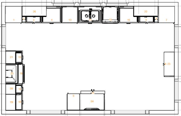
And that kitchen would look like this on our whole house floor plan, sitting behind the music room and the dining room, with access to the desk on the left side and the carport on the right side…


But what I noticed about the comments was the the majority of people who urged me to go with the bigger kitchen chose that one simply because of the size, but then went on to have all kinds of suggestions for changes. I should move the deck door here and make it a double French door, and then move the range here, and move the sink over there, and the refrigerator is in a bad place, so it needs to be moved, and then I need to add an island.
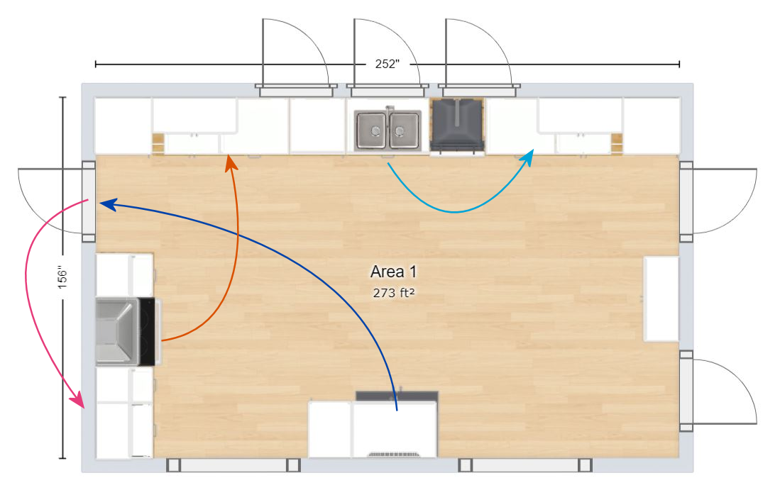

I tried so many different arrangements, but with all of those openings into the kitchen (two exterior doors, one laundry room door, and two large cased openings), I just couldn’t make it work. To make the work triangle a reasonable distance, I’d almost have to add an island, and not a movable one. I’d have to add one that had one of the three elements of a work triangle incorporated into it. But I do not want an island. And really, a decent sized island wouldn’t work in there anyway unless I move the back wall back at least two feet. And I don’t want to keep enlarging and enlarging and enlarging when it’s just not necessary.
I also have to admit that I love the idea of having doors at the back of the music room that lead to our deck. I don’t know what that would mean for the music room doors. Could I keep them and close them when I want privacy at night? Or would they interfere with the actual exterior doors? I sure would hate to lose them. I think those doors “make” the music room. That room wouldn’t be nearly special without them.
But I just kept going back to the galley kitchen design. I love the arrangement, the efficiency, and the fact that there aren’t five doorways chopping up the space.
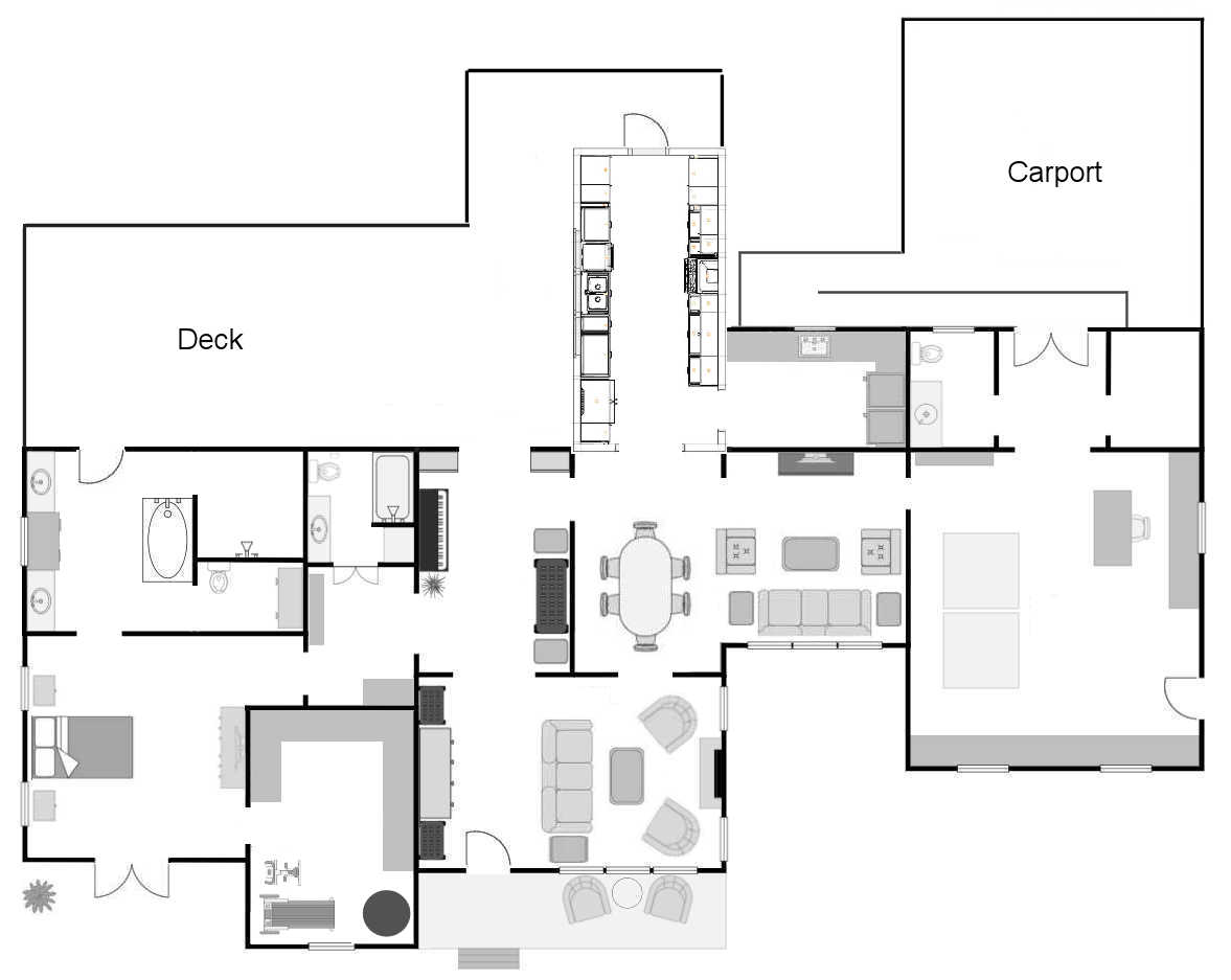

So I went back to the floor planner and made two minor adjustments. I moved each of the side walls out one foot. And just like that, it clicked. The bigger kitchen in the previous post was 13′ x 21′. And if I move the walls of this kitchen out one foot on either side, that makes this kitchen 12′ x 20′. And since this is arranged so much more efficiently, and has a proper work triangle, I don’t think I would miss that one additional foot going either direction.


In fact, I tried to add an additional foot of width to make it 13 feet wide like the other kitchen, but that threw off the work triangle. The general rule is that each leg of a work triangle (the triangle formed by the sink, range, and refrigerator) should not be less than four feet or more than nine feet, and the total of the three legs should not be more than 26 feet.
With the kitchen at 12′ x 20′, and the work triangle arranged as you see it above, that puts my work triangle within those measurements. If I make the kitchen 13 feet wide, it makes the work triangle too big. So a kitchen that is 12 feet wide is perfect!
For all intents and purposes, my current kitchen is basically a galley kitchen. Technically, it’s not since it has two exits at one end, and a wall of cabinets at the end. But it does have that arrangement of two items of the work triangle on one side, and the third item on the opposite side.


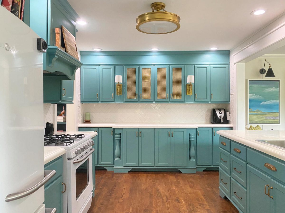

So this past Wednesday night when everyone was here, I paid close attention to how people move around the kitchen. The kitchen is definitely a gathering place. People just naturally congregate in the kitchen, and it does feel a tiny bit tight, but it’s not really bad. We weren’t stumbling over each other. And this kitchen is only 9′ 9″ wide and 14 feet long. So if I widen it by two feet and lengthen it by six feet, there will be plenty of room for how we use the kitchen.
In order to do this, I will have to steal one foot from the pantry (future laundry room), but I’m okay with that. That will leave me with 7.5′ x 11′ for a laundry room. That’s plenty of space, especially considering that my new-ish washer and dryer will stack if I need them to. So here’s an approximate view of how the kitchen looks in relation to the whole house floor plan.


So with all of that said, here’s a look at the floor plan drawing from the IKEA kitchen planner. And you’ll notice that by extending the side walls out a foot on each side, that gives me room for French doors! I’m pretty excited about that.


And here’s the drawing of the sink and fridge side of the room. I even went so far as to make a list of everything I currently have in my kitchen and pantry, measure the items, and make sure I had a space for them in this kitchen. So the cabinets shown in these drawings are what I chose based on what I actually need. On the two previous kitchen arrangements, I just chose cabinets somewhat at random to get a general idea of the layout, but this time around, I got more specific.


And then this is the opposite wall with the range and the door to the laundry room. You’ll notice that I did not center the range with the cabinets because that would throw off the work triangle and make the trek from the range to the fridge ridiculously long. It’s much more important to me to have the sink centered under three windows. That’s a non-negotiable for me. And another non-negotiable is to have the fridge just inside the kitchen from the dining room. So the range had to be the floater to accommodate my wishes for the other two.


I just absolutely love how this looks. Those French doors at the end have me so excited! And I can’t wait to have those windows over the sink. I long for direct sunlight into my kitchen!


This kitchen actually has way more storage than what I need. I know it’s not a bad thing to have too much storage. But this is way more storage than what I have in my current kitchen and pantry combined.


And here is the view back towards the dining room.


And then the opposite view back towards the back yard.


And then I have a few countertop height views that I’ll let you tour…


So while there may be some minor modifications after I meet with the contractor on Tuesday, I’m 99% sure that my future kitchen will have this arrangement. But now I can let my mind rest. I feel prepared to meet with him next week.
Addicted 2 Decorating is where I share my DIY and decorating journey as I remodel and decorate the 1948 fixer upper that my husband, Matt, and I bought in 2013. Matt has M.S. and is unable to do physical work, so I do the majority of the work on the house by myself. You can learn more about me here.


